Did you know…
Why is blue origin logo a feather?
Short answer
Blue Origin uses the feather as an emblem of flight itself: the company presents it as a symbol of flight's perfection, grace and freedom rather than of speed or power. It sits on a crest alongside two tortoises and the Latin motto Gradatim Ferociter, step by step, ferociously.
A symbol of flight itself
The feather is the company's chosen emblem of flight, presented as a symbol of its perfection, its grace and the freedom it represents. The choice says something about the firm's temperament: not a swept arrow, not a flame, not speed, but the quiet engineering of a bird's wing, which nature arrived at long before anyone built an aeroplane. For a company whose stated purpose is to make access to space ordinary and repeatable, an emblem of effortless flight fits better than one of brute force.
The crest and the motto
The feather does not stand alone. Blue Origin's coat of arms places it alongside a pair of tortoises reaching upwards, above the Latin motto Gradatim Ferociter: step by step, ferociously. The tortoises are a deliberate nod to the fable, and to the company's argument that the race is won by steady, deliberate progress rather than by sprinting. Founded in 2000 and famously secretive for its first decade, it spent years doing exactly that while noisier rivals launched.
Where you actually see it
The emblem is painted on New Shepard's booster and capsule and appears on mission patches and hardware. The same restrained visual language runs through the naming: New Shepard for Alan Shepard, the first American in space, and New Glenn for John Glenn, the first American in orbit, each vehicle matching its namesake's flight, suborbital and orbital respectively. Read together, the crest and the names make a single claim about continuity, with an emblem of flight applied to machines named after the people who first left the ground.
More questions
- Image pending
Astronauts and life in space
Why does astronauts float in space?
Because they are in free fall, not because gravity is absent. At the International Space Station's altitude of about 400 km, Earth still pulls almost as hard… more…
- Image pending
Astronauts and life in space
Why did yuri gagarin die?
Gagarin died in an aircraft crash, not in a spacecraft. On 27 March 1968 the MiG-15UTI trainer he was flying with instructor Vladimir Seryogin went down in… more…
- Image pending
Astronauts and life in space
How much an astronaut is paid?
NASA's civilian astronauts are ordinary federal employees, paid on the General Schedule grade-and-step scale with no bonus per flight, per spacewalk or per… more…
.png)
Astronauts and life in space
Why is blue origin so slow?
Blue Origin was built on deliberate, owner-funded incrementalism: its motto is Gradatim Ferociter, step by step, and it spent its first two decades on… more…
Astronauts and life in space
When did astronauts last walk on the moon?
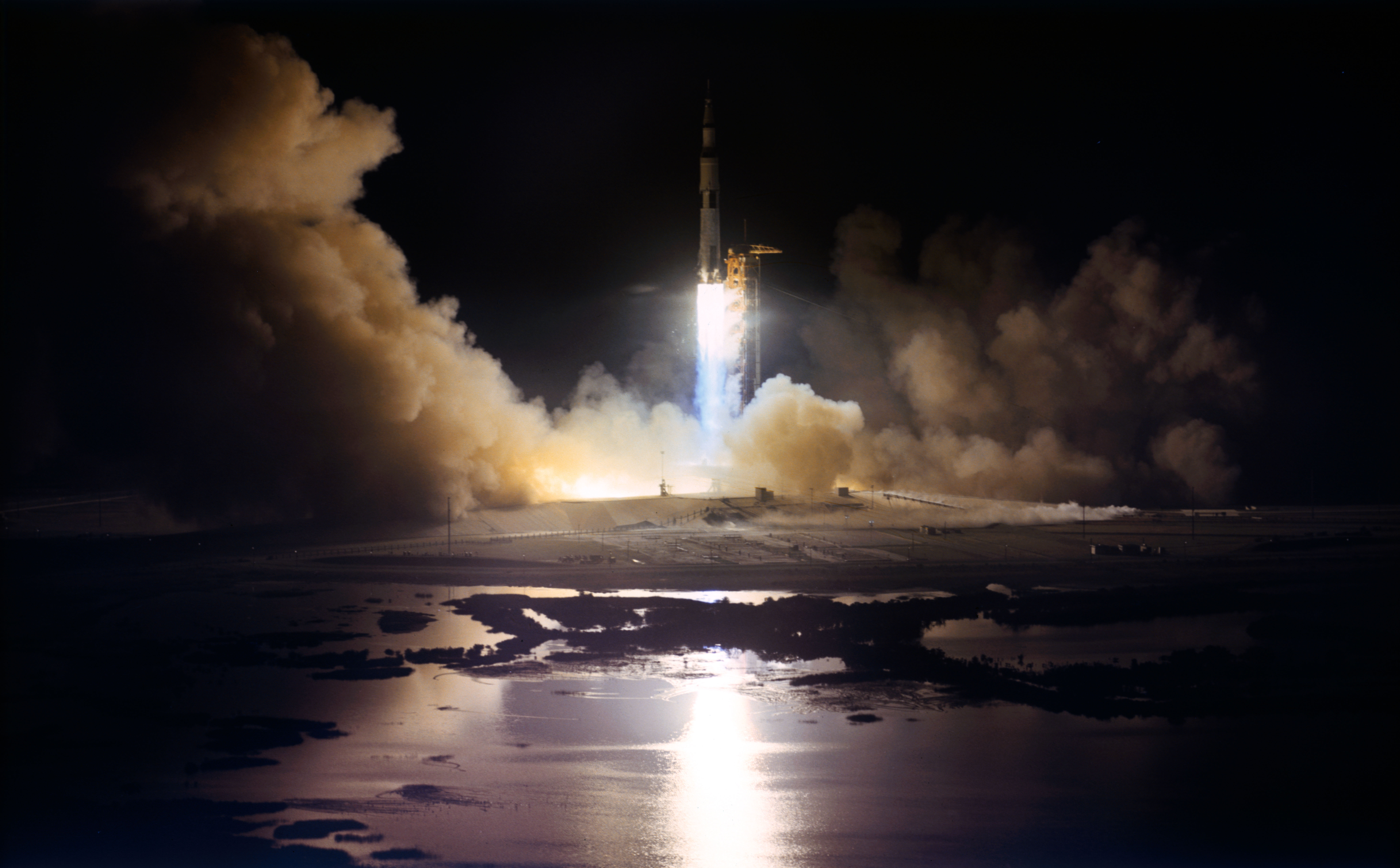
Apollo 17, in December 1972. Eugene Cernan and Harrison Schmitt landed in the Taurus-Littrow valley on 11 December 1972, worked on the surface for three days… more…
- Image pending
Astronauts and life in space
How high do astronauts orbit the earth?
Crewed spaceflight today happens a few hundred kilometres up. The International Space Station orbits at about 400 km, lapping the planet roughly every 90… more…
